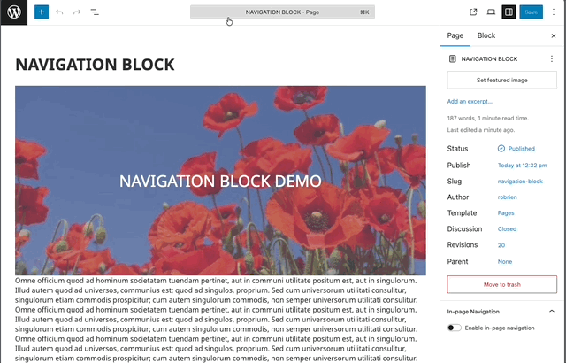
Navigation Block — Editor Guide
Add a site navigation menu to pages and posts. This block extends the WordPress core Navigation block with improved styling, submenu handling, and a mobile overlay menu.
Find it in:
- Block Inserter (+) → Design System → Navigation
After inserting the block, select a WordPress Menu in the block settings.
How it works
- Uses your existing WordPress Menus
- Create or edit menus in WordPress Admin → Appearance → Menus
- In the block settings, choose which Menu to display
- Enhanced styling for:
- Top-level items
- Submenus (nested)
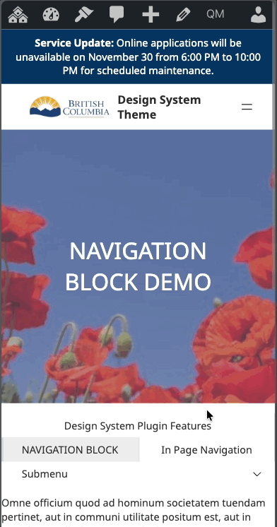
- Editor preview
- Mobile menu toggle (hamburger)
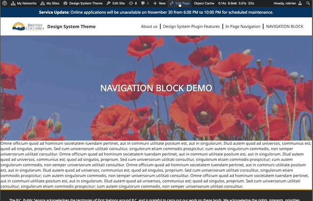
- Responsive behavior:
- Desktop: inline menu
- Mobile: optional full-screen overlay with a toggle
- Overlay behavior is controlled by Overlay Mode and the Mobile Breakpoint
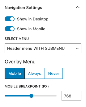
Key settings
Overlay Mode
- Always Overlay: Always show as an overlay with a toggle
- Mobile Overlay: Switch to overlay below the Mobile Breakpoint
- Never Overlay: Always show as a standard inline menu
Mobile Breakpoint
- Width at which Mobile Overlay activates (for Mobile Overlay mode)
- Default: 768px
- Adjustable in the block settings
Visibility
- Show on Desktop: Visible at widths ≥ Mobile Breakpoint
- Show on Mobile: Visible at widths < Mobile Breakpoint
- Note: If both are disabled, the menu still renders as a safety fallback to avoid hiding site navigation entirely. To truly hide it, use theme visibility controls or CSS.
Submenus
- Desktop: Open on hover; close when the pointer leaves the submenu area
- Mobile: Open/close via the arrow toggle next to the parent item
- Nested submenus are positioned to remain within the viewport
Accessibility: Behavior mirrors the core Navigation block for keyboard and screen-reader support.
Usage tips
- Keep mobile labels concise to prevent wrapping in the overlay
- Manage structure in Appearance → Menus; items are not added in the block editor
- Test across breakpoints to confirm overlay and visibility match expectations
Testing
- Add the Navigation block to a page or post.
- In the settings panel, select a WordPress Menu.
- Configure Overlay Mode, Mobile Breakpoint, and Visibility.
- View the page and resize:
- Above the breakpoint: confirm desktop menu and hover submenus
- Below the breakpoint: confirm mobile toggle, overlay, and tap-to-open submenus
- Confirm the current page is highlighted in the menu.
Troubleshooting
- No menu appears:
- Ensure a Menu is selected in the block settings
- Verify the selected Menu has items in Appearance → Menus
- Overlay toggle not visible on mobile:
- Set Overlay Mode to Mobile Overlay or Always Overlay
- Ensure Show on Mobile is enabled and breakpoint is appropriate
- Can’t hide the menu entirely:
- Both visibility toggles off still render the block as a safety fallback; use theme visibility controls or CSS to hide if needed