Patterns Overview
All patterns are designed to be responsive, mobile-friendly, accessible, and optimized for performance. The goal is to allow you to easily drag and drop any number of these patterns in any order on a page without needing to modify any code or block settings—simply update the content and colors as needed. You should be able to create a multi-page site using any combination of these patterns, without the need to develop new ones.
If you're new to WordPress's Block Patterns, check out the WordPress's Block Patterns Guide
BC Gov Logo Light
Description:
This is an experimental pattern that is not yet ready for use.
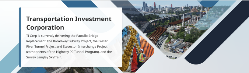
Horizontal Card with Large Image
Description:
Full-width layout with flexible content area and optional button component.
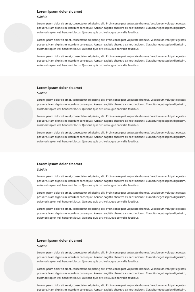
Vertical Cards
Description:
Flexible card layout that supports both images and icons.
Hero Image with Title
Description:
Main banner images with text overlay

Secondary Hero
Description:
Smaller banner sections with compact layout


Heading with Paragraphs
Description:
Text content with styled heading
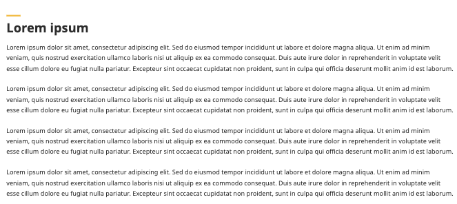
Image & Text
Description:
Image and text content blocks with flexible layout options

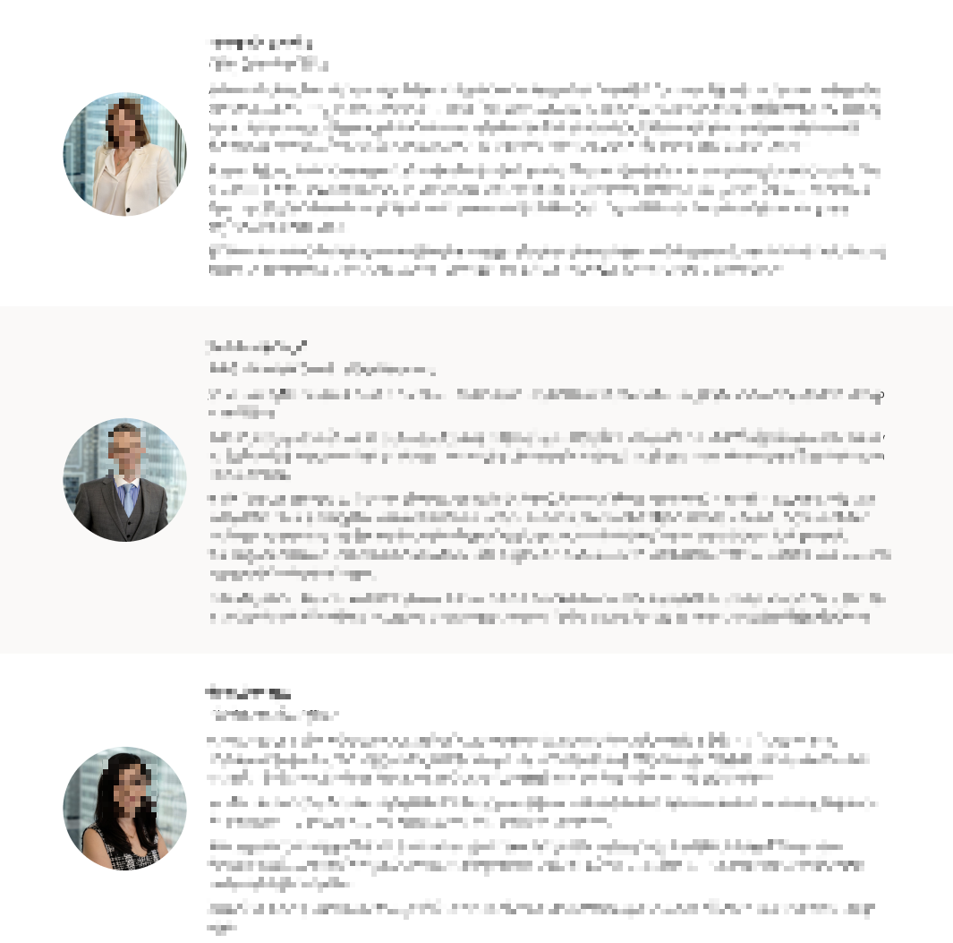
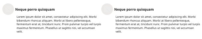
Team Pattern
Description:
Staff and team member displays with contact information
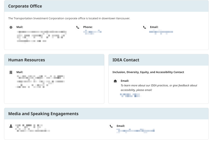
Information Contact Socials
Description:
Contact information
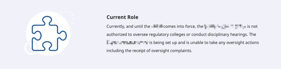
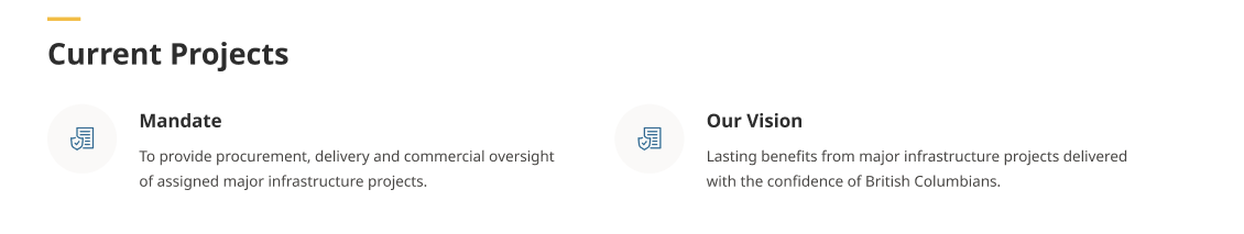
Icon with Excerpt
Description:
Short content blocks with icons
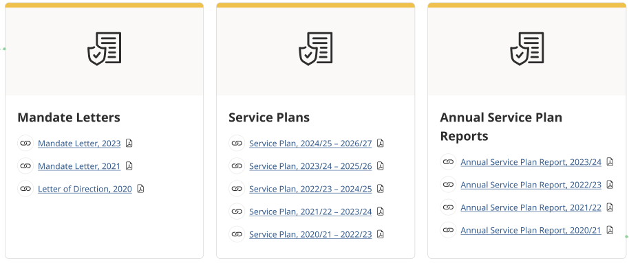
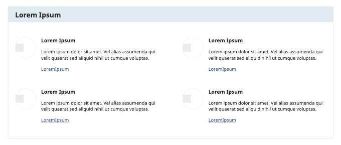
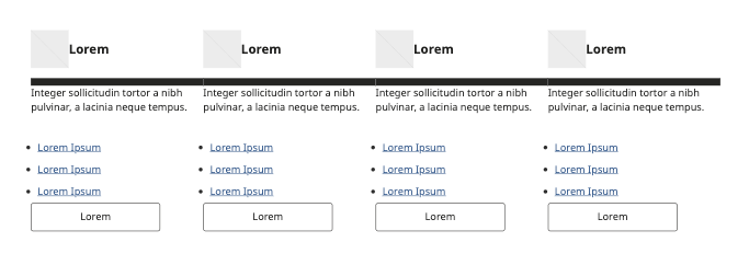
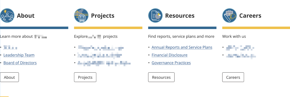
Card with Hyperlink List
Description:
Card layout with icon and title at the top
Best Practices
Pattern Selection
- Choose patterns based on content type
- Maintain consistency across pages
- Consider mobile responsiveness (How patterns look on mobile devices when stacked on top of each other)
Content Population
- Replace all placeholder text
- Use appropriate image sizes
Accessibility
- Include alt text for images
- Maintain color contrast
- Ensure proper heading structure
Performance
- Optimize images before upload
- Don't overload pages with patterns
- Consider load times