DSWP Vertical Cards
Overview
This pattern creates a responsive grid of vertical cards, each containing an image, heading, description, and a linked call-to-action. It's ideal for showcasing services, features, or content categories in a visually consistent format.
Important Note
Each pattern consists of several blocks. Only adjust the content and color block settings. The structural settings (padding and margins) are pre-configured for responsiveness. Modifying structural settings may break the pattern.
Pattern Components
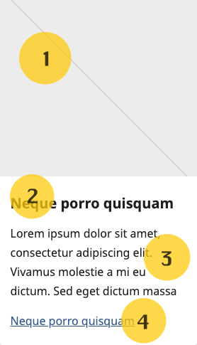
Each card consists of the following blocks (numbers correspond to the image above):
- Featured Image - Full-width image (250px height, object-fit: cover)
- Heading - Card title (H5)
- Description - Body text
- Link - Call-to-action
Layout Options
The pattern supports 2, 3, or 4 column layouts. Cards automatically stack on mobile devices for optimal readability. 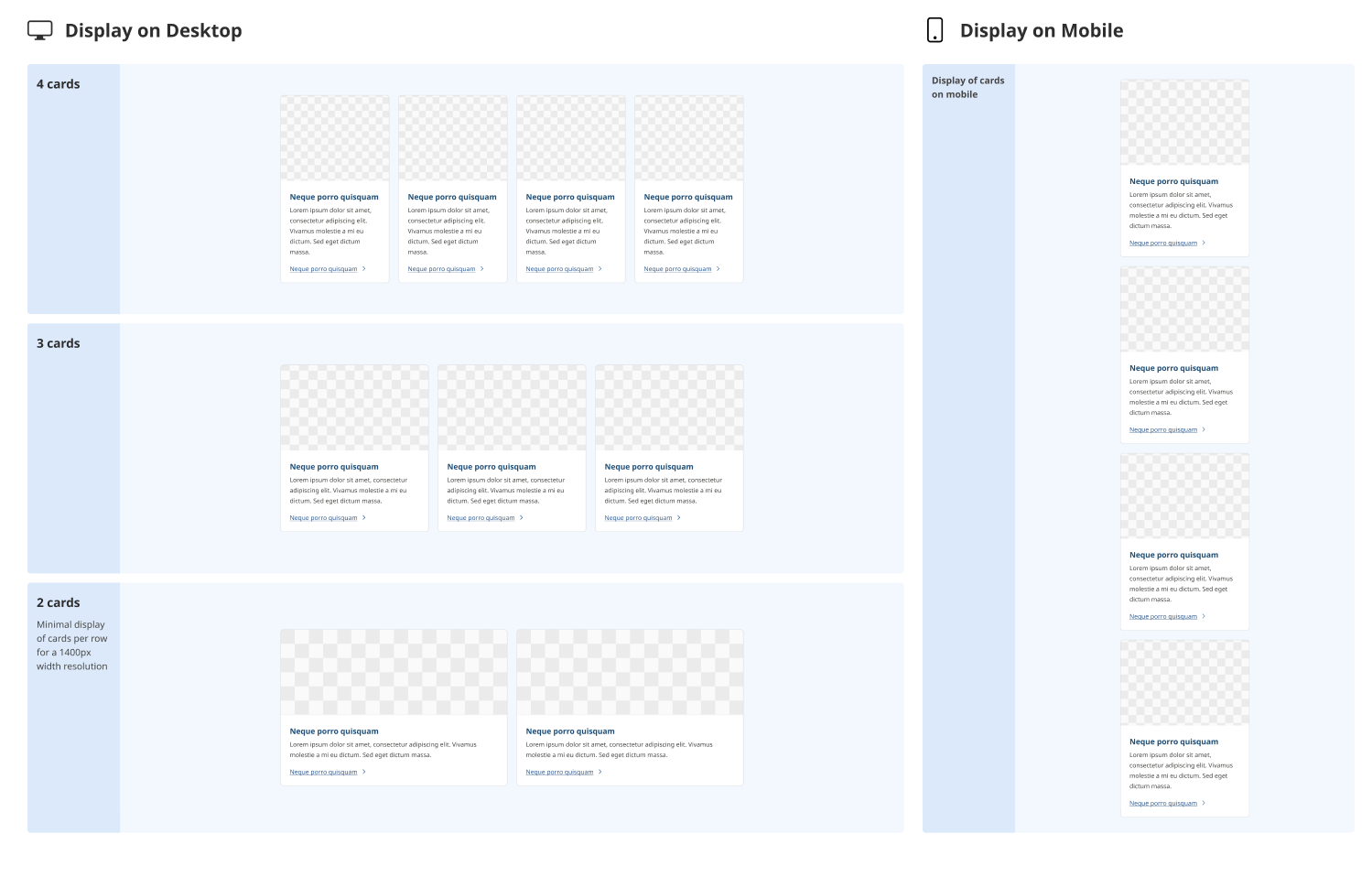
Common Tasks
Modifying Cards
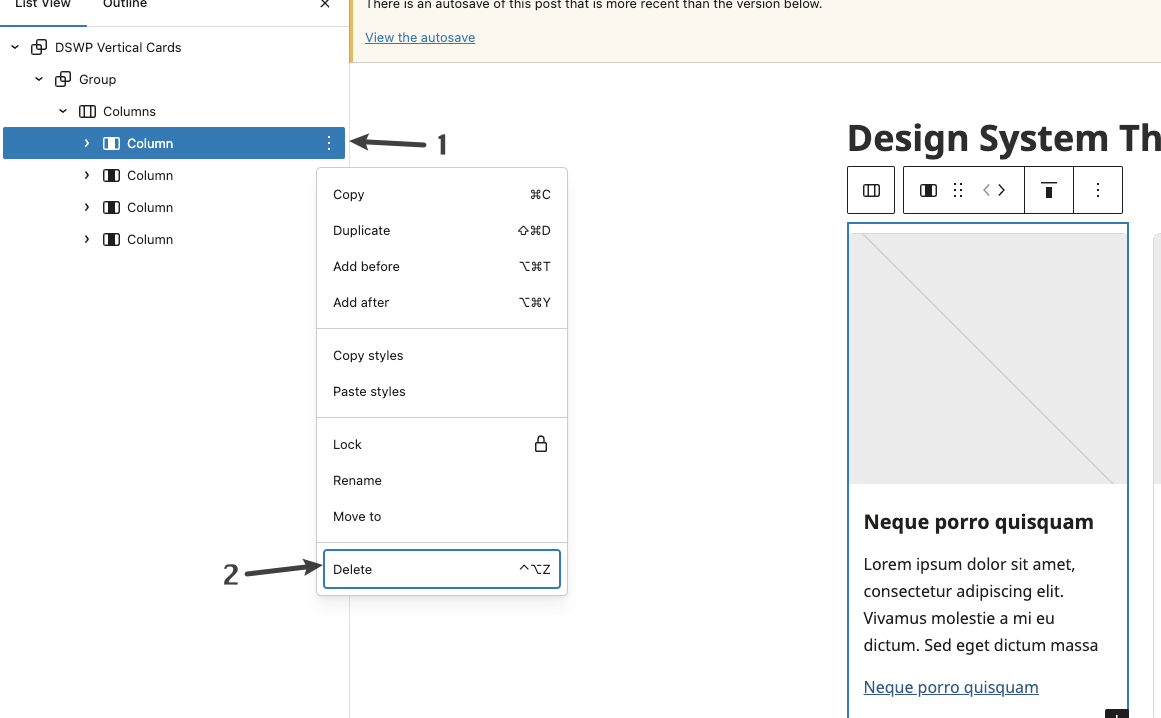
To Remove a Card:
- Click the ellipses (⋮) next to the card you want to remove
- Select "Delete"
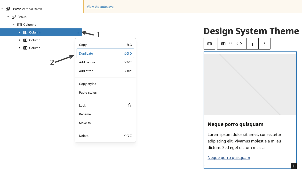
To Add a Card:
- Click the ellipses (⋮) next to any existing card
- Select "Duplicate"
Customizing Elements
Example: Changing the image
- Click on the existing image
- Select "Replace"
- Upload or choose a new image
- The image will automatically resize to fit the card dimensions
Block Documentation
For detailed instructions on modifying specific blocks, refer to WordPress's official documentation: