DSWP Vertical Cards With Icon
Overview
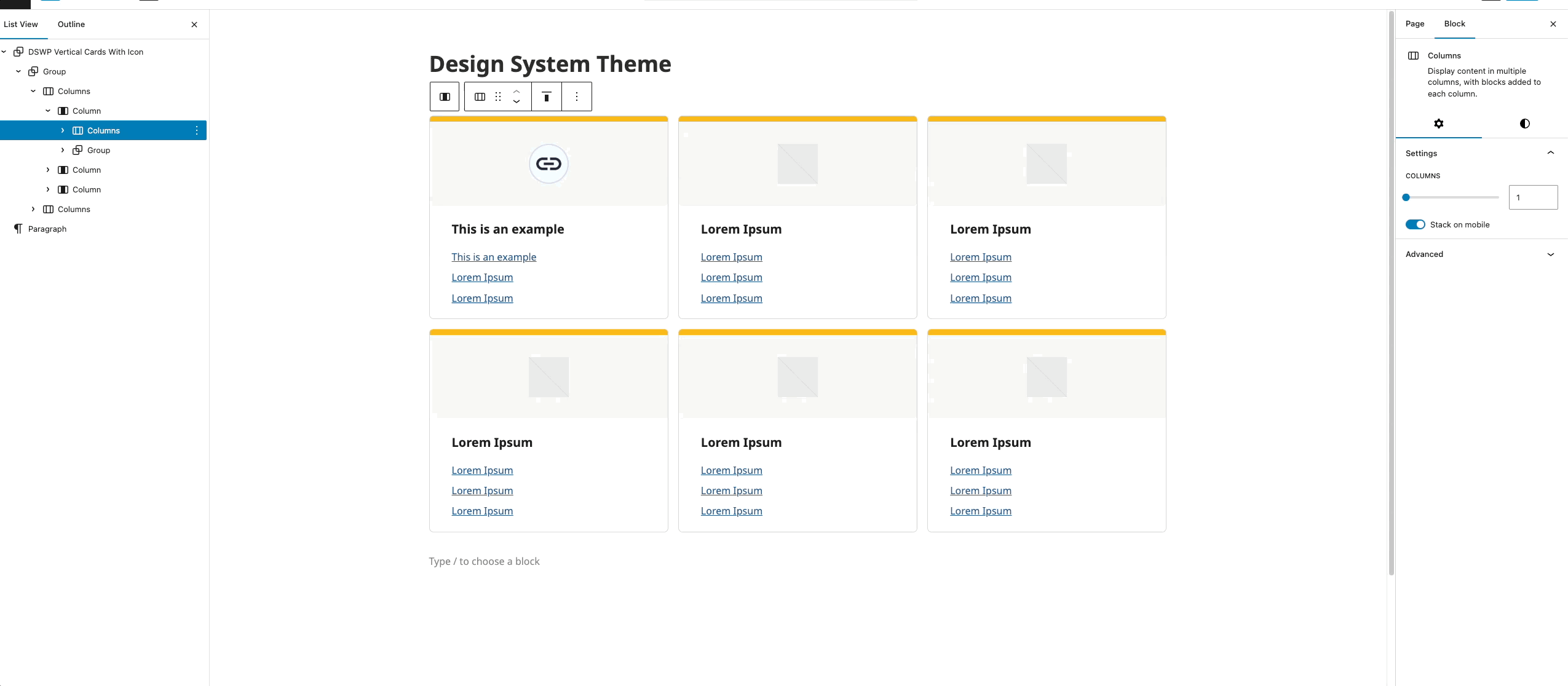
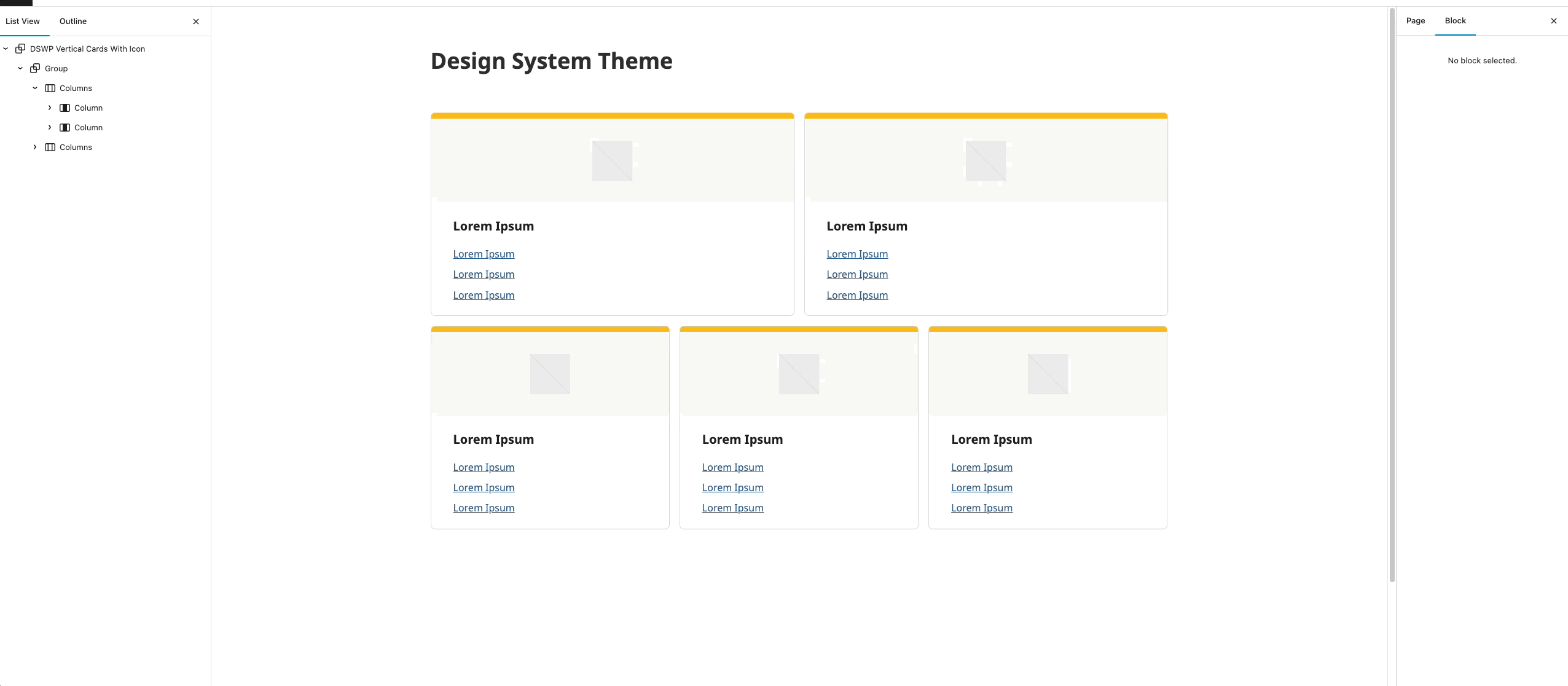
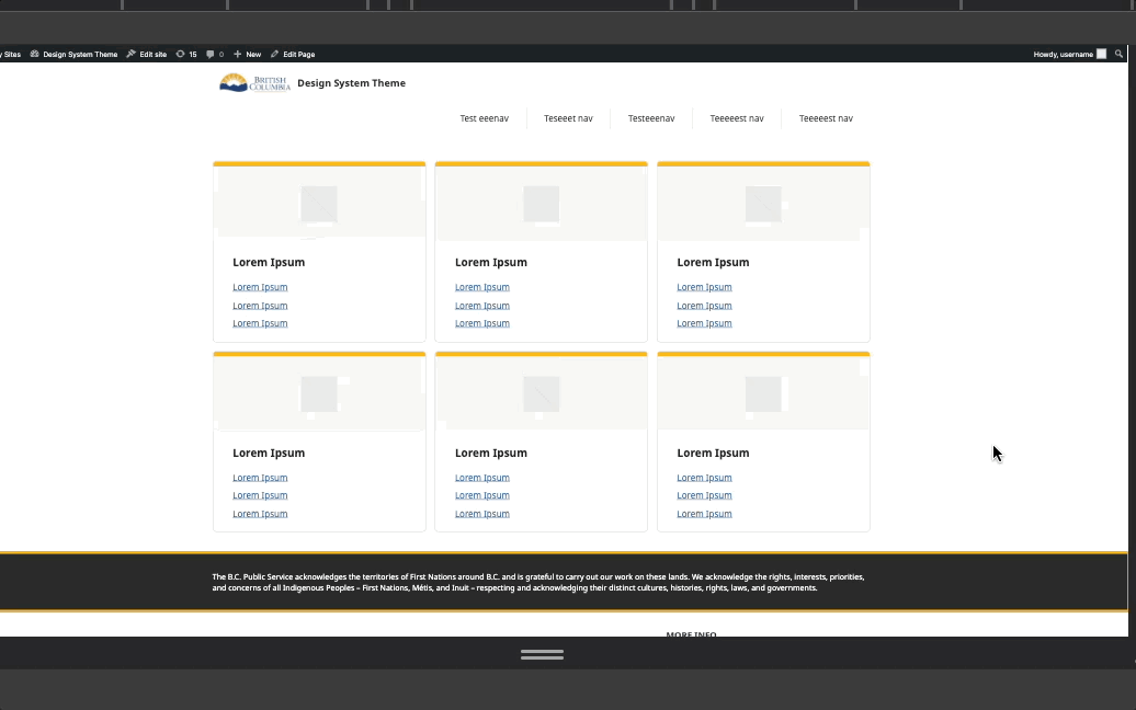
This pattern creates a grid of vertical cards, each featuring an icon, heading, and a list of links. The cards have a distinctive gold top border and light gray background (both which can be changed), with a consistent layout and spacing.
Important Note
The structural settings (padding, margins, borders) are pre-configured for responsiveness. Only modify content and colors to maintain design consistency.
Pattern Components
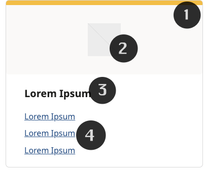
Each card contains:
Container
- 1px border (dswp-surface-color-border-default)
- 7px border radius
- Light gray background
- 9px gold top border
Icon Section
- Square image (256px)
- Light gray background
Heading Section
- H5 heading (xx-large font size)
Links Section
- Three linked items (default, can add more)
Common Tasks
Modifying border color:
- Click on the heading text
- Type your new heading
- The styling will automatically apply
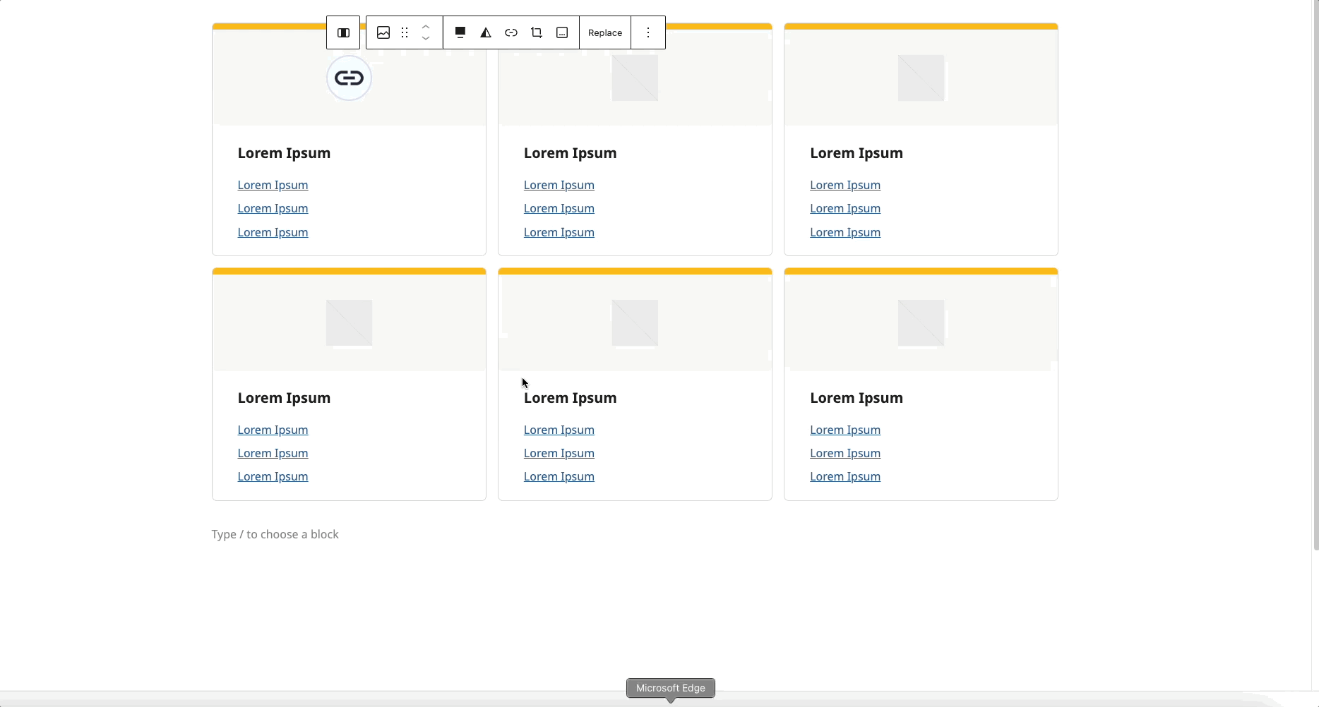
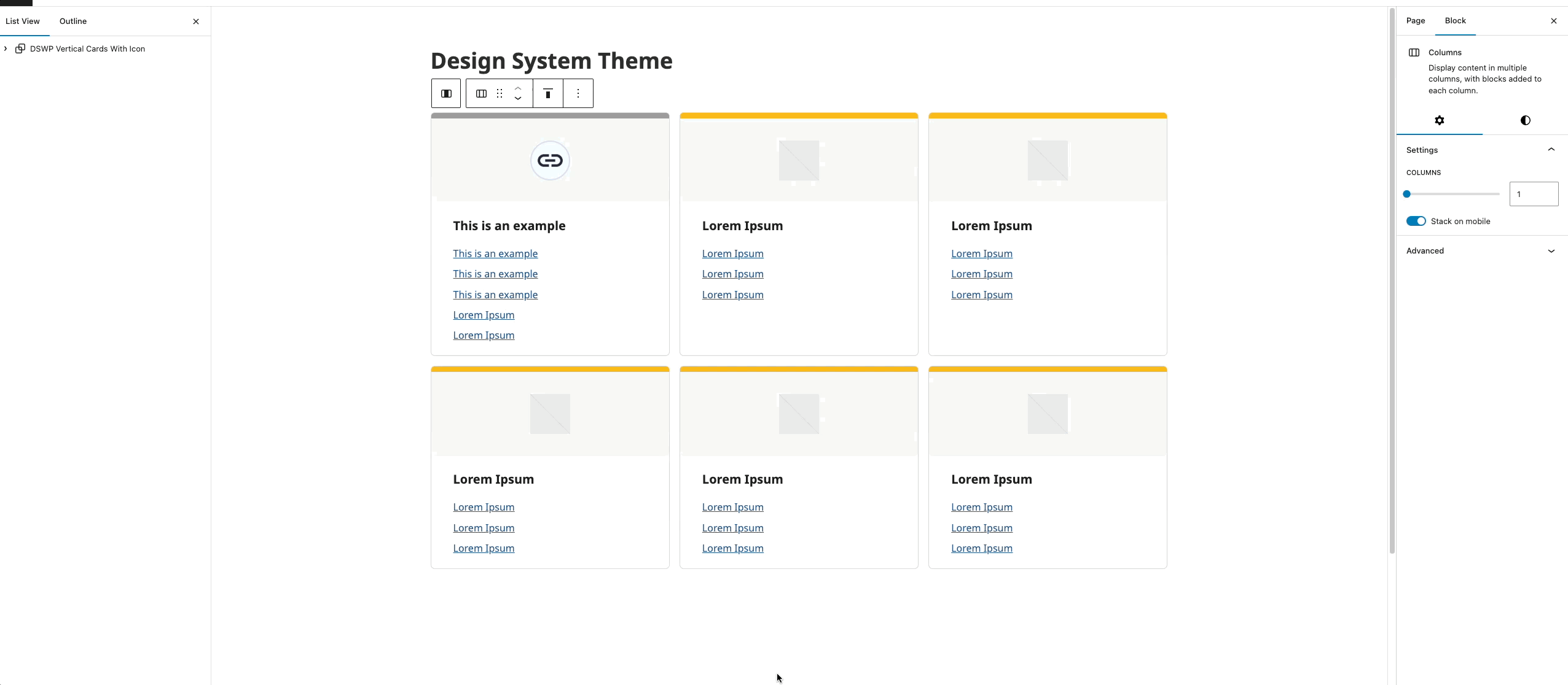
Icon Replacement:
- Select the image block
- Click "Replace"
- Upload or select image
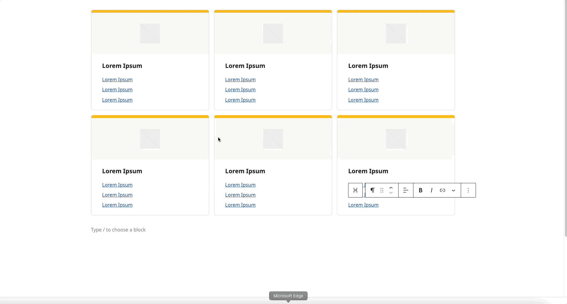
Modifying the Heading:
- Click on the heading text
- Type your new heading
- The styling will automatically apply
Updating Link:
- Select the link text
- Update URL and text as needed
To Add a Card:
- Click the ellipses (⋮) next to any card (see gif below)
- Select "Duplicate"
Removing a card:
- Click the ellipses (⋮) next to any card (see gif below)
- Select "Delete"
Layout
- Desktop: 3x2 grid
- Mobile: Single column
Block Documentation
For detailed instructions on modifying specific blocks, refer to WordPress's official documentation: