Reading the results
The results page opens in a new tab. From top to bottom:
Run summary
A header block recording how the run was made: timestamp, signed-in BCGW user, source aquifer, the T and S values used (tagged “(override)” if you supplied them), pumping rate, duration, buffer radius, and filter state. A run ID (a unique code) identifies this specific run; it also appears on the PDF export.
If the run used manual entry, an orange banner appears here.
Stat cards
A row of summary cards giving the headline counts and figures: Total wells, OK, At risk, Insufficient data, Suspect data, Outside validity, and Maximum predicted drawdown. The same status names are used in the per-well details table below.
Below the cards sits an export bar with one button per format — CSV, KML, PDF, and interactive HTML map. See Exporting results.
Distance-drawdown chart
A chart of drawdown against distance from the pumping well, matching the legacy Excel tool (iMapBCDistDrawdown, D. van Everdingen & M. Leahey, 2024):
- Well dots — one per nearby well, labelled with its WTN. Dot colour matches the well’s Status (see Status flags below) — the same colour scheme is used on the map below.
- Black curve — the Cooper-Jacob drawdown curve.
- Orange bars — each well’s Safe Available Drawdown (SAD), drawn down from its point.
- The Y axis is inverted — drawdown increases downward, the standard hydrogeology convention.
WTN labels alternate above and below their dot, so two wells at similar distances from the pumping well don’t print on top of each other. On a busy buffer even that isn’t enough — untick Show well tag numbers on the chart above the chart to strip it back to dots. Hovering any dot still names the well, and the PDF export captures the chart exactly as you left it on screen.
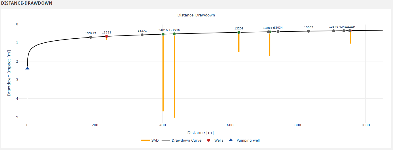
The distance-drawdown chart: well dots (colour matches Status), Cooper-Jacob curve (black), SAD bars (orange).
Impact % per well
A bar chart of each well’s predicted impact as a percentage of its Safe Available Drawdown (SAD), sorted by magnitude of impact. A dashed vertical line marks the 30 % at-risk threshold — bars at or above the line are flagged as at-risk. Wells with no computable impact (missing NPL or well depth) are excluded from this chart — they appear in the details table below with an INSUFFICIENT_DATA status.
The chart grows taller as the buffer gets busier so that every bar keeps its WTN. Past roughly 85 wells there is no longer room to label them all; the caption says so when that happens, and you can hover a bar for its WTN or read them off the details table.
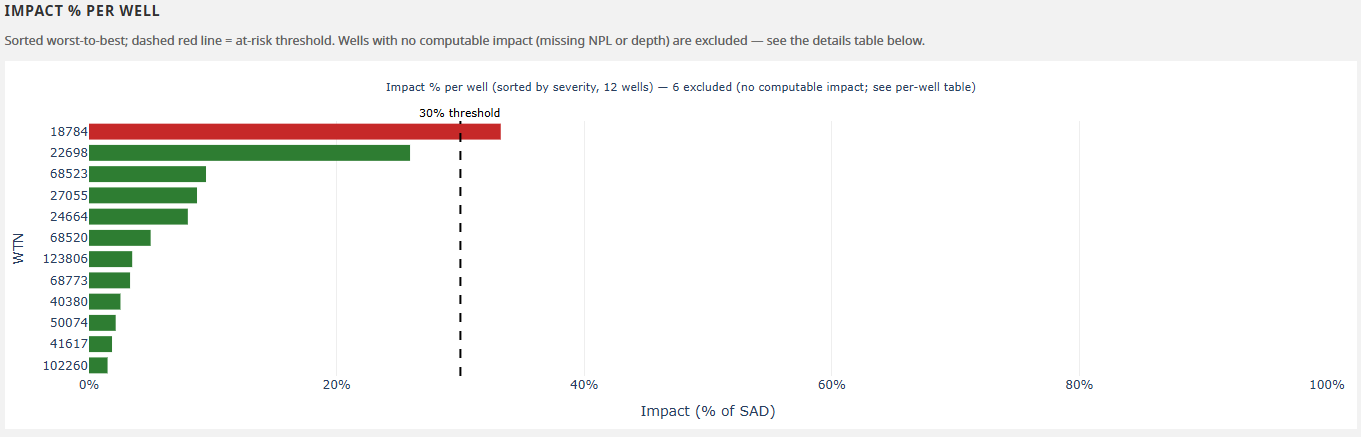
The Impact % per well chart: bars sorted by magnitude of impact, with the dashed 30% at-risk threshold line.
Wells in buffer (map view)
A colour-coded map of the wells inside the buffer radius. Marker colour matches the Status column in the details table; marker size scales with the magnitude of predicted impact. A dark ring around a marker means that well is currently licensed in GWELLS — wells recorded as Unlicensed, Historical, or with no licence status are drawn without a ring. Clicking a marker highlights the matching point on the distance-drawdown chart, and clicking a chart point highlights the matching marker — the two views are linked. The marker pop-up carries the well’s aquifer number and licence status alongside its drawdown, SAD, and impact.
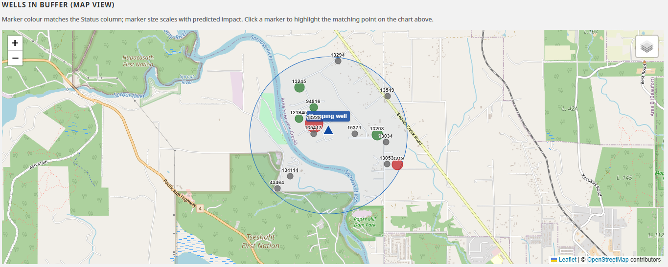
The results map. Marker colour matches the Status column; marker size scales with predicted impact.
At-risk wells summary table
Lists only the wells where the predicted impact is at least 30 % of that well’s Safe Available Drawdown (SAD), with columns: WTN, reassigned aquifer material, SAD (m), impact (m), and impact as a percentage of SAD. Sorted descending by impact percentage.
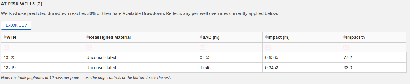
The at-risk wells summary table.
Per-well details table
Every observation well, with the full set of attributes (WTN, intended use, licence status, aquifer ID, depths, yield, water level, distance, predicted impact, SAD, status, and more). The table is sortable, filterable, and paginated.
Licence shows the well’s status as recorded in GWELLS — Licensed, Unlicensed, Historical, or Unknown where GWELLS does not say. It is shown for context only and does not affect any status or at-risk calculation.
Aquifer ID is the aquifer GWELLS assigns the well to. A number marked (not delineated) — for example 1143 (not delineated) — is one GWELLS uses but the provincial aquifer layer has no mapped polygon for, so it is not a formally delineated aquifer. Those wells are still analysed and still shown: predicted drawdown does not depend on whether the aquifer has been mapped. A blank cell means GWELLS assigns the well to no aquifer at all, which is a different thing. The marker also appears in the map pop-up, the CSV, the PDF, and the KML.
Editable columns and live recompute
Four columns can be edited directly in the table:
- Non-pumping water level (NPL)
- Finished well depth
- Stickup — BCGW does not record this; the table is the only place to supply it.
- Top of fracture / aquifer / screen — for confined or fractured bedrock wells, read from the driller’s log.
When you edit a cell, the tool recomputes that well’s SAD, status, the at-risk summary, and the stat cards above — immediately, with no re-query to BCGW. Edited rows are tinted light yellow, and the rightmost Edited column lists which fields were adjusted on each row (so the edits survive the CSV export). Click Reset all overrides above the table to clear every edit in one go.
Both the at-risk and per-well tables have their own Export CSV button above them — separate from the whole-run exports at the top of the page — which exports the table’s current sort + filter view.
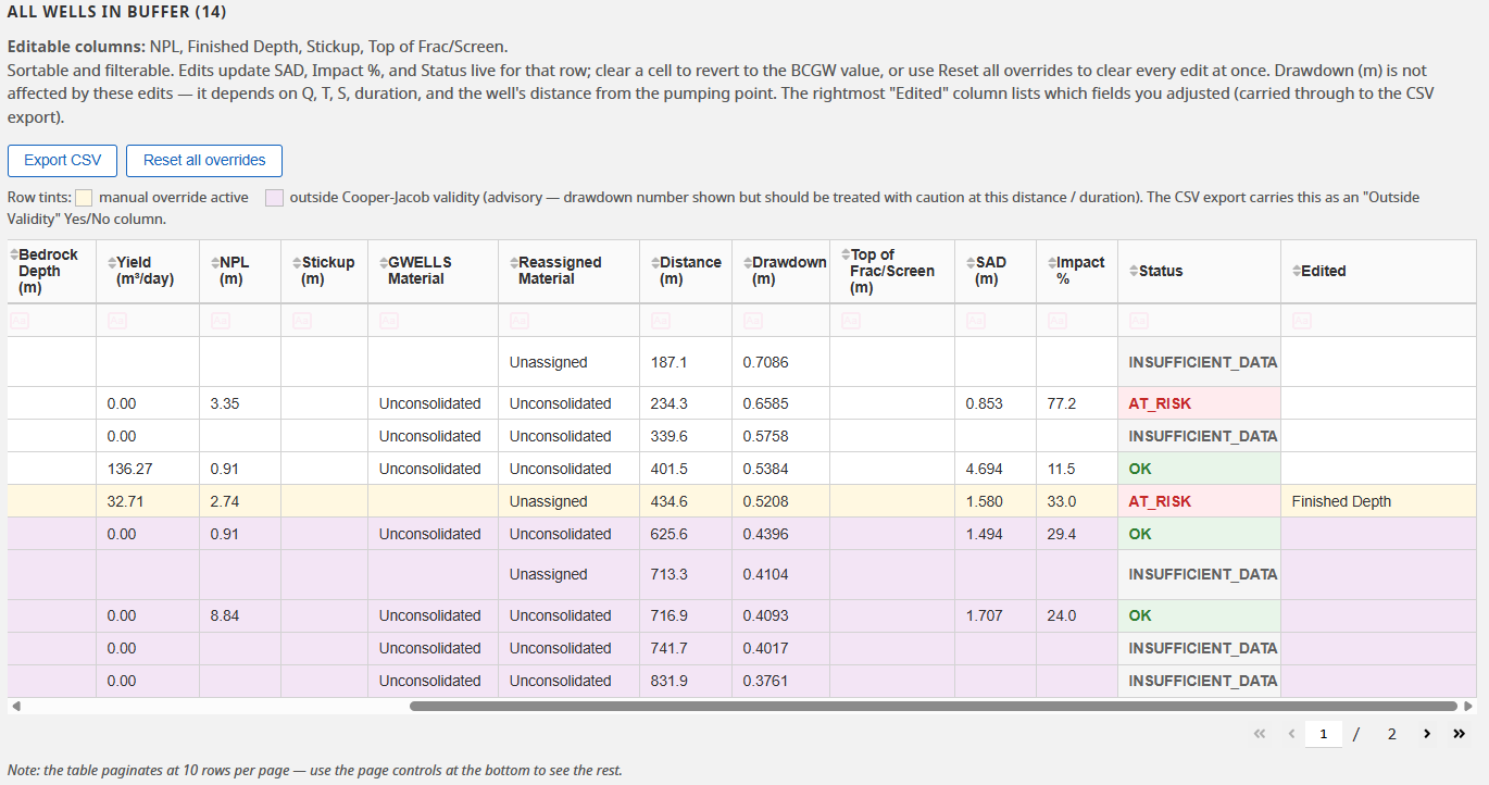
The per-well details table. Yellow rows have edited values; purple rows fall outside the Cooper-Jacob validity range.
Status flags
Each well is classified. The same colour appears in the stat cards, the distance-drawdown chart dots, the map markers, and the per-well table’s Status column:
| Status | Colour | Meaning |
|---|---|---|
| OK | Green | Predicted impact is below 30% of the well’s SAD. |
| AT_RISK | Red | Predicted impact is 30% of SAD or more. |
| INSUFFICIENT_DATA | Grey | SAD could not be computed — a required value (water level or well depth) is missing. |
| SUSPECT_DATA | Orange | SAD was computed but is non-positive — the BCGW baseline record for that well looks physically impossible and should be checked against the driller’s log. |
Rows with a light-purple tint fall outside the Cooper-Jacob validity range for this distance and duration — the predicted drawdown for those wells is less reliable and should be treated as advisory.
Always review. These are screening-level estimates. Confined and fractured-bedrock wells, in particular, may need a manual review of the driller’s log — the tool flags them with a note. Have a qualified hydrogeologist review the results.
Next: Exporting results.