The Survey Builder allows you to create and customize surveys from scratch, or clone existing surveys or templates and edit them.
Learn more about creating a new survey on the Create a New Survey page or about editing a survey on the Edit a Survey. Once you have created or cloned your survey, or want to edit your survey, you’ll do this in the Survey Builder.
On the survey builder page, you can edit your survey name by clicking the edit icon next to your survey name.
You can also turn on/off the multi-page option. Please note: if you toggle this option on/off after adding some content, you will lose all the content you created so far (even if you have previously saved your survey).
The left panel includes all the draggable survey components you can choose to add to your survey. All survey components are powered by forms.io. For more information on forms.io, visit the form.io help centre. Please note, form.io has been customized to make it easier to use. The version you see on the website might differ from the one used in Modern Engagement Tools.
Below the left panel, you will see the options to hide your survey and make your survey a template.
Learn more about hiding a survey on the Hide a Survey page. Learn more about saving your survey as a template on the Save Survey as a Template page.
Survey Components
Survey components are entirely customizable depending on your survey type. Some surveys may only use one or two components, while others may choose to use all of them.
Each survey component will include settings respective to their function. Some components such as the Header will only have Display settings, while components such as radio buttons or checkboxes will have other sections offering more options for entering data and component customization.

Settings
Display: These are settings that modify the front-end UI of a component. The Display setting tab will be the first tab open when editing the component settings.
Values: Values settings relate to how Values are set or how Values are interacted with between fields. Use Values Settings to set a default value or set up data calculation. For example, if you add a question that can be answered with Radio Buttons, you would set the possible answers to your question here. (For example, Yes and No). The label is what will show in your survey. The Value is auto-generated and is what the system will use. If you set a conditional question, you’ll use the values to set it up.
Validation: Settings found in the Validation Tab relate directly to the configurable Front-End and Back-End validations for the field. Validation covers settings such as required fields, unique data, min/max requirements, custom validations, and custom error messages.
Conditions: The simple conditional option triggers a condition based on the data input of a single field on a form. For example, if the answer to question 1 is A, display Question B. You can also implement more advanced conditions by using JavaScript. Learn more about JavaScript Validation at the bottom of the page.
For more information on the component settings, please visit {https://help.form.io/userguide/form-building/component-settings}.
Survey Components
Below are examples of the survey components available in this tool.
- Header:
This will allow you to add a pre-formatted header.
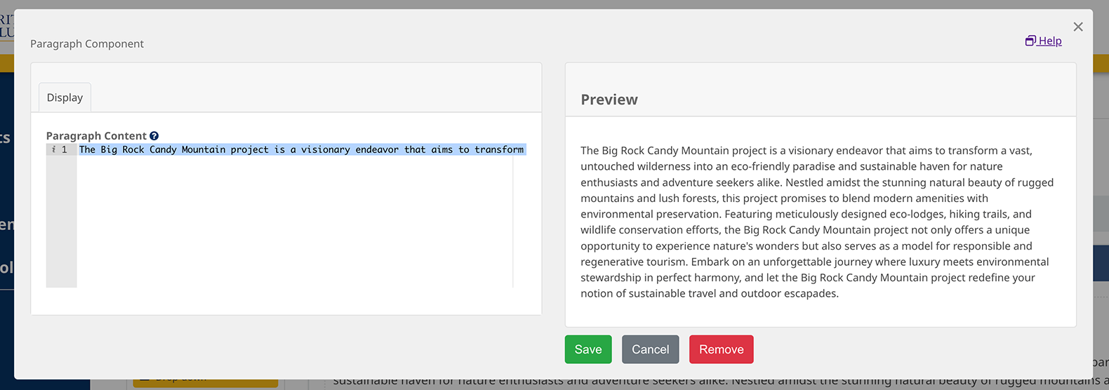
- Paragraph:
This will allow you to add a pre-formatted paragraph. Please note, that if you want to add links or images, you will need to use the more advanced Content component.
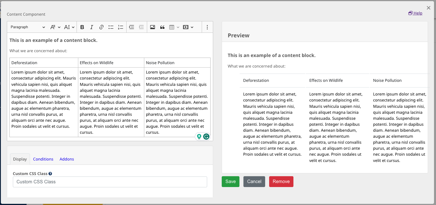
- Content:
The content component lets you add text and format it with a rich-text editor. Use the content component if you want to add links, lists, images, quotes, or tables. Tables are useful if you want to display information as a grid or text in columns.
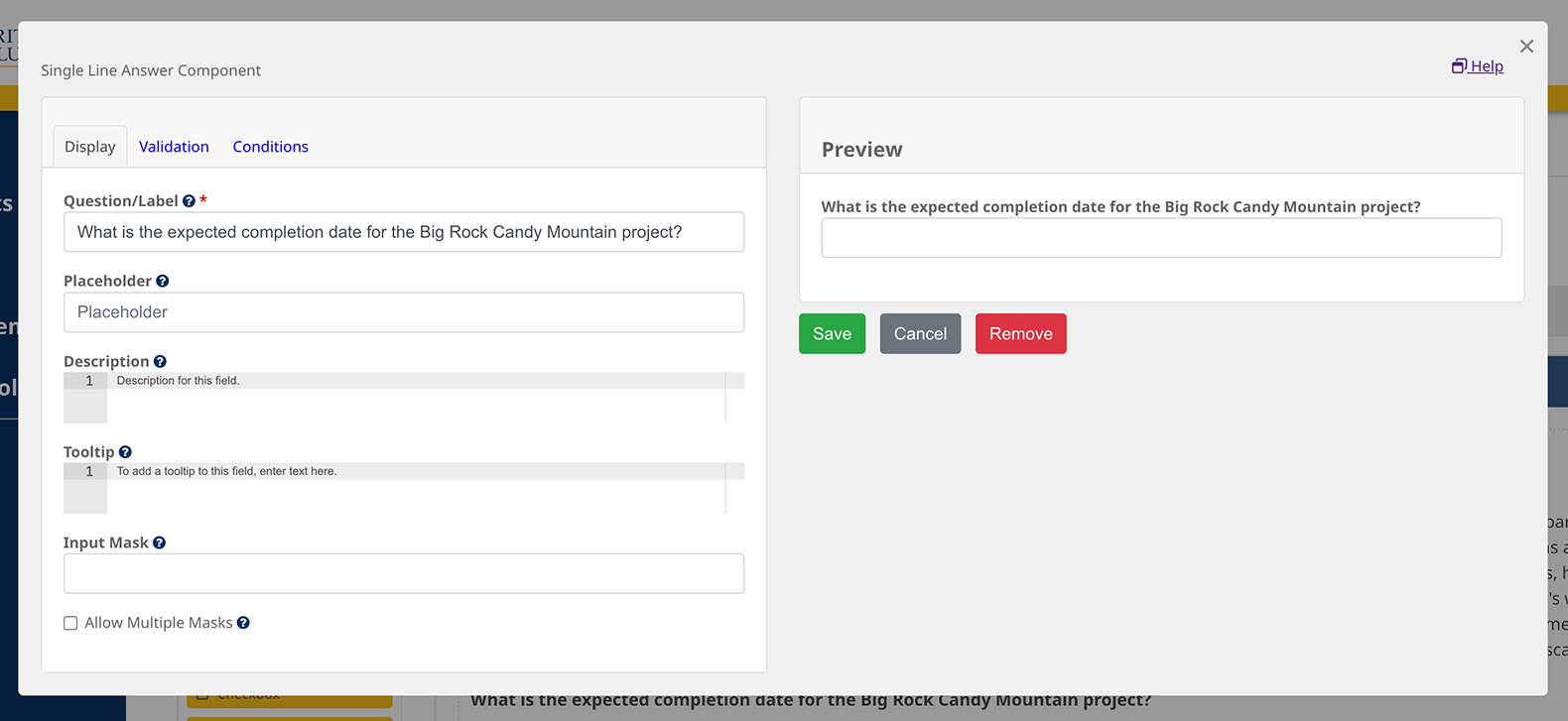
- Single Line Answer:
This is used to add a question that requires a short answer only. The respondent will have to enter their answer in a single line of text or less. Single Line Answers are considered a “written comment” and will have to be reviewed. Approved Single Line Answers will show in the comments section of the internal report and public report (unless it was selected to not be included in the public report on the Report Settings page).
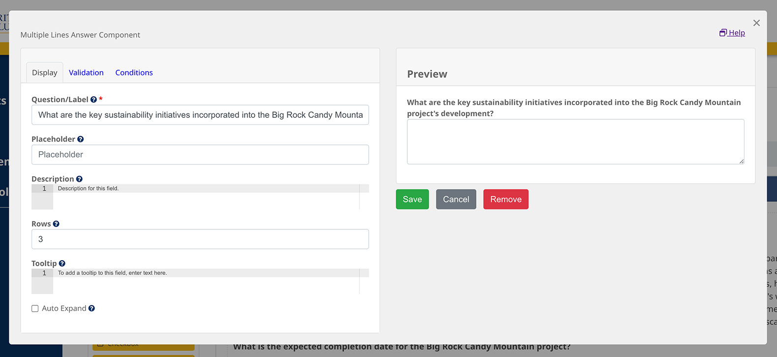
- Multiple Lines Answer:
This is used to add a question that requires a long answer. The respondents will be able to enter as much text as they want unless a rule to limit the number of characters or words on the validation tab. Multiple Lines Answers are considered a “written comment” and will have to be reviewed. Approved Multiple Lines answers will show in the comments section of the internal report and public report (unless it was selected to not be included in the public report on the Report Settings page).
- Drop-down:
This component is used to ask respondents to select one or many options from a long list of five or more options such as a list of geographic areas.
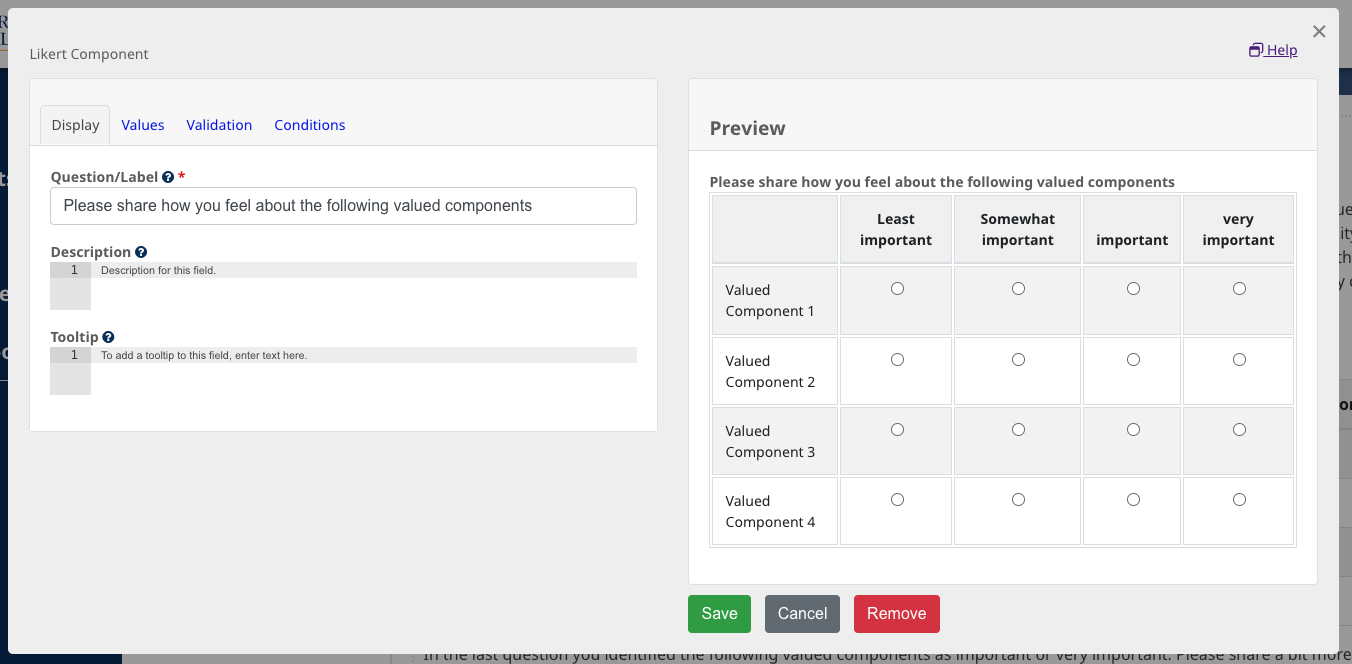
- Likert:
A Likert matrix is a type of rating scale used to measure attitudes or opinions across various questions or statements. Each row of the matrix contains a statement or question, and respondents are asked to indicate their level of agreement or frequency on a consistent scale, typically ranging from “Strongly Disagree” to “Strongly Agree” or similar labels. It’s especially useful in surveys or questionnaires when one wants to gauge the intensity of feelings or perceptions on multiple items in a standardized manner. The Likert matrix simplifies data collection and analysis by presenting a uniform set of response options for a series of statements. Learn more about how to apply conditions to Likert using JavaScript at the bottom of the page.
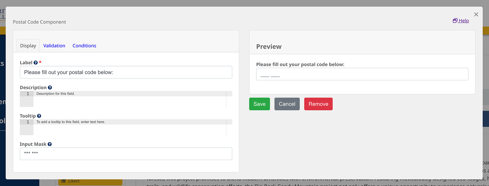
- Postal Code:
Use the Portal Code component to collect the first three characters of a Canadian postal code. This can be used to understand the location of your respondents. Please note: Modern Engagement Tools does not currently support the display of the locations captured by this component on a map. A third-party software will have to be used to analyze the data collected. Please make sure you have the PIA to collect that information and hide this question from the Public Report on the Report Settings page.
- Radio Button:
Radio Buttons allow users to select one option from a set of predefined choices. When a radio button within a group is selected, any previously selected radio button in the same group is automatically deselected, ensuring that only one choice is made. They are best used when you want to ensure the user selects only one option from a list, such as choosing a payment method or selecting a gender.
- Checkbox:
Checkboxes allow users to select multiple options from a set of choices. Each checkbox operates independently, allowing more than one to be checked at a time. They are ideal for scenarios where multiple selections are acceptable, like choosing hobbies or selecting features for a product.
Advanced
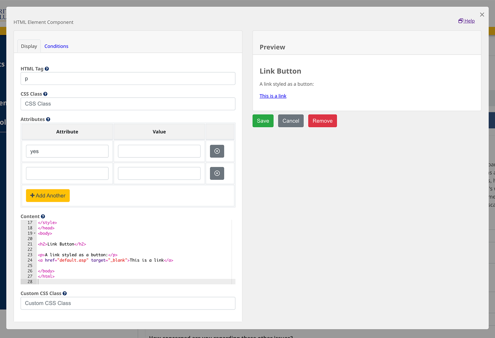
- HTML Element
HTML element is a more advanced component that offers the option to add a variety of custom-built sections through HTML. You can add your HTML tag (p, table, img etc), and style it by adding a CSS class and its attribute and value.
Advanced Conditions using Javascript
Most components’ conditions can be set directly in the modal on the Conditions tab. You can also use JavaScript to set more advanced conditions. If you want to add conditions to a Likert Matrix, JavaScript is the only way to do so. Here is an example of code you can use to add conditions to a Likert.
To add conditions using JavaScript, you have to select the “Edit JSON” option from the small icons that appear on the right as you hover over the component.
Likert Matrix conditional coding:
Show a subsequent question if a single sub-question within a Likert matrix has one of a select number of responses
show = ["responseOption1", "responseOption2", "responseOption3"].includes(data.questionId.subQuestionId) e.g. show = ["effective", "veryEffective", "somewhatEffective"].includes(data.simplesurvey1.other)
Show a subsequent question if a single sub-question within a Likert matrix has a single response.
show = data.questioniD.subQuestionId == "responseOption" e.g. show = data.simplesurvey2.other == "effective"
True when any sub-question has a given set of responses: Show a subsequent question when any sub-question within a likert matrix has one of a select number of responses
show = Object.values(data.questionId).some(value => ["responseOption1", "responseOption2"].includes(value)) e.g. show = Object.values(data.simplesurvey4).some(value => ["important", "veryImportant"].includes(value))

