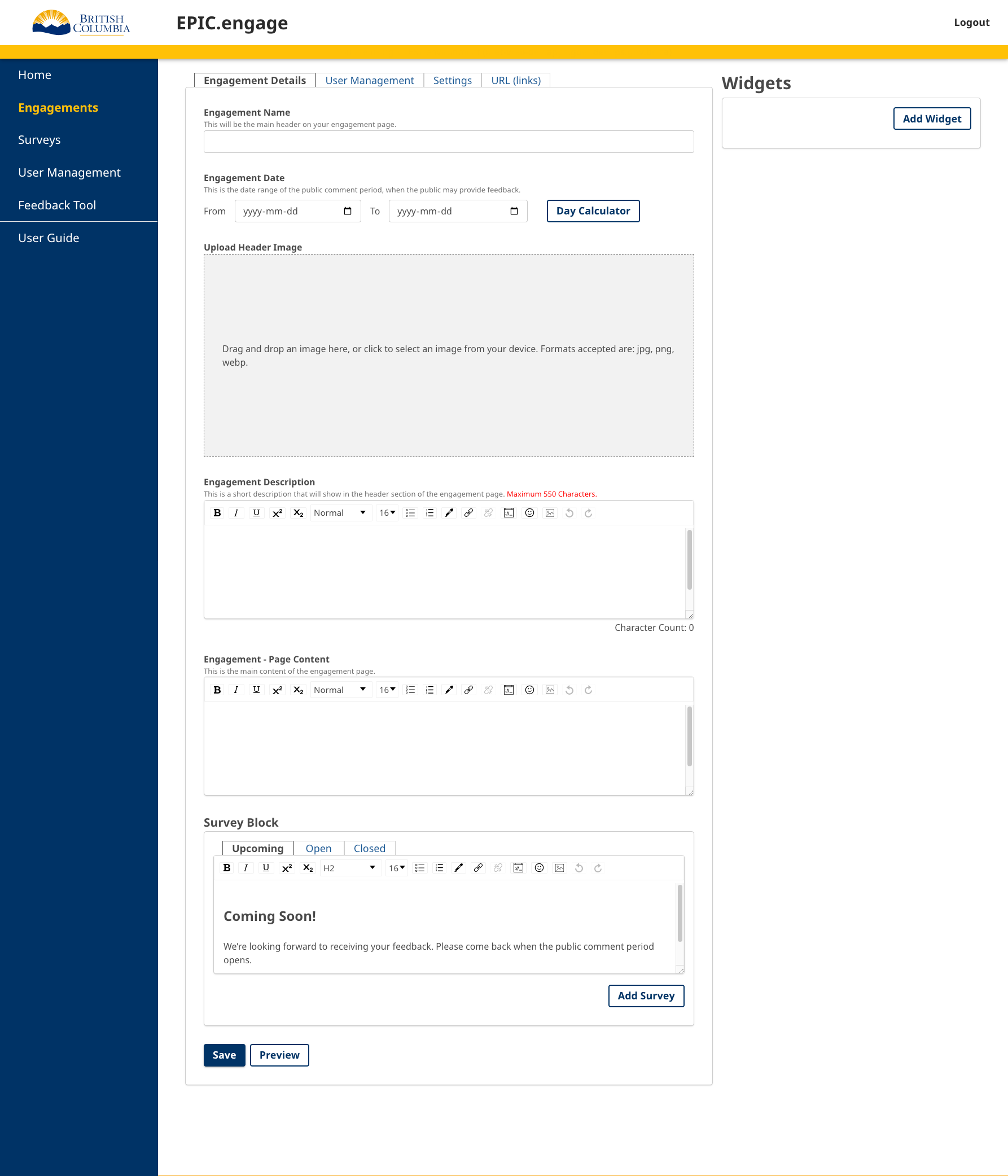
The Engagement Details tab allows you to build your engagement from scratch.
The fields in this tab include:
Engagement Name: Name or title of your engagement.
Engagement Dates: These are the dates the engagement will be open to the public to provide feedback. You can publish the engagement so it is live and visible to the public before the engagement opens. The day calculator function on the right side helps you to calculate the number of days an engagement will be open. Engagements will open (be accessible to the public) just a few seconds past midnight on the date the Engagement starts, or as soon as the engagement page is published if the Engagement start date is the current data or before.
Header Image: This image should be representative of the project or specific engagement. The image should be 1920px x 480px. You can add a larger image and crop it to this size after you upload it. The cropping feature is set to the correct size automatically.
Engagement Description: The engagement description is intended to be a short summary of the engagement that will be displayed on the main engagement page, in the header section. The maximum number of characters allowed is 550 characters, including punctuation and spaces.
Engagement Content: The engagement content provides more detail about the engagement. This is where most of the engagement content such as project details should be.
Survey Block: The survey block has three (customizable) options for each status of the engagement with a default text that is editable. This is what an external user would see at the bottom of an engagement when a survey is either upcoming, open, or closed. The survey block (public view) will also display a button to access the survey when the survey is open, and a link to the survey report (dashboard and public comments) when the engagement is closed.
Widget Block: This block allows you to add widgets to your engagement (after the engagement has been created) and view the widgets you have added. The widget cards can be moved up and down (drag and drop) to reorganize their order on the page. You can also remove a widget from your engagement by clicking the X icon at the right of the card.
For more information on the Widget features, go to Widgets’ page.
At the top of the page, you will see tabs for User Management, Settings, and URLs (Links).
For more information on User Management within an engagement, go to Engagement User Management.
For more information on engagement Settings, go to Engagement Settings.
For more information on the engagement URLs (links), go to URLs (links).
