Easily generate pie charts, AKA bar charts with polar coordinates, using ggplot2 with a simplified customization interface for common modifications. Pie charts are rarely the most effective way of visualizing data (especially when >5 groups are being compared), but that doesn't mean there shouldn't be an easy way to build one with ggplot2 in case your project stakeholders ask. See this blog post for an introduction to ggplot2.
plot_pie(
  data,
  fill_var,
  y = NULL,
  ...,
  title = NULL,
  title_hjust = 0.5,
  caption = NULL,
  caption_hjust = 0,
  fill_var_order_by_y = NULL,
  fill_var_order = NULL,
  fill_var_labs = NULL,
  fill_var_values = NULL,
  palette = c("plasma", "C", "magma", "A", "inferno", "B", "viridis", "D", "cividis",
    "E"),
  palette_direction = c("d2l", "l2d"),
  palette_begin = 0,
  palette_end = 1,
  fill_var_title = NULL,
  slice_text = NULL,
  slice_text_prefix = "",
  slice_text_suffix = "",
  slice_text_colour = "black",
  slice_text_size = 4,
  slice_text_custom = NULL,
  line_size = 1,
  round_n = NULL,
  lump_n = NULL,
  lump_lab = NULL,
  facet_var = NULL,
  facet_var_order = NULL,
  facet_var_labs = NULL,
  facet_var_strip_position = c("top", "bottom"),
  facet_var_text_bold = TRUE,
  greyscale = FALSE,
  text_size = 14,
  font = c("sans", "serif", "mono"),
  legend_position = c("right", "left", "bottom", "top"),
  omit_legend = FALSE,
  aesthetic_options = FALSE
)
Arguments
- data
A data frame or tibble containing at least one categorical variable.
- fill_var
A categorical variable to assign to the slice fill colour (quoted or unquoted), e.g. fill_var = "grouping_variable" or fill_var = grouping_variable. Produces separate slices each level of the fill variable. See
aesfor details.- y
A numeric variable containing values to be used for calculating pie slice sizes. If y is not specified, then pie slice sizes will be based on the relative frequency of fill_var categories. If y is specified, then the slices will represent fractions of the sum of the y-variable under each category of fill_var.
- ...
graphical parameters (not associated with variables) to be passed to
geom_bar, e.g. colour (affects slice outlines), to be applied to all slices. To see some of the available options in a web browser, set the aesthetic_options argument to TRUE.- title
Add a main title to the plot using a character string, e.g. "pie chart title"
- title_hjust
Left-to-right/horizontal justification (alignment) of the main plot title. Accepts values from 0 (far left) to 1 (far right). Default is 0.5 (centre).
- caption
Add a figure caption to the bottom of the plot using a character string.
- caption_hjust
Left-to-right/horizontal justification (alignment) of the caption. Accepts values from 0 (far left) to 1 (far right). Default is 0 (left).
- fill_var_order_by_y
This allows you to sort the slices of the chart in order of increasing/ascending ("i" or "a") or decreasing ("d") value of y. If no variable is assigned to y, then the sorting occurs based on the frequencies of the fill_var categories.
- fill_var_order
This allows you to manually modify the order of the fill variable groups, e.g. fill_var = grouping_variable, fill_var_order = c("group_2", "group_1"). See
fct_relevelfor details.- fill_var_labs
This allows you to modify the labels of the fill variable groups, e.g. fill_var = grouping_variable, fill_var_labs = c("group_1_new_label" = "group_1_old_label", "group_2_new_label" = "group_2_old_label"). See
fct_recodefor details.- fill_var_values
This allows you to modify the colours assigned to the fill of each of the fill variable groups, e.g. fill_var = grouping_variable, fill_var_values = c("blue", "red"). See
scale_fill_manualfor details. For the colour options available in base R, seecolour_options.- palette
If a variable is assigned to fill_var, this determines which viridis colour palette to use. Options include "plasma" or "C" (default), "magma" or "A", "inferno" or "B", "viridis" or "D", and "cividis" or "E". See this link for examples. You can override these colour palettes with fill_var_values.
- palette_direction
Choose "d2l" for dark to light (default) or "l2d" for light to dark.
- palette_begin
Value between 0 and 1 that determines where along the full range of the chosen colour palette's spectrum to begin sampling colours. See
scale_fill_viridis_dfor details.- palette_end
Value between 0 and 1 that determines where along the full range of the chosen colour palette's spectrum to end sampling colours. See
scale_fill_viridis_dfor details.- fill_var_title
this allows you to modify the fill variable label in the plot legend.
- slice_text
Adds text with slice percentages ("pct"), total counts/values ("tot"), or fill_var group labels ("grp") to the middle of each slice.
- slice_text_prefix
Adds a prefix string to slice_text labels separated by a single space, e.g. if your slices represent monetary totals (via a y-variable), then you might set this to "$"
- slice_text_suffix
Adds a suffix string to slice_text labels separated by a single space, e.g. if your slices represent percentages (e.g. slice_text = "pct"), then you may want to set this to "%"
- slice_text_colour
Controls slice text font colour. For the colour options available in base R, see
colour_options.- slice_text_size
Controls the slice text font size.
- slice_text_custom
Use this to specify custom slice text labels instead of using one of the convenience options provided by the slice_text argument. Must be a character vector of length equal to the number of slices (fill_var categories).
- line_size
Controls the slice outline thickness if a colour is specified (e.g. colour = "black").
- round_n
If slice_text = "pct" or "tot" this allows you to round the values to n significant digits. See the
round"n" argument documentation for details.- lump_n
If there are so many fill_var categories that you find the plot difficult to interpret, you can use this to lump/combine the least common categories together into an "other" category. Simply specify the number of categories you want to retain and the rest will be lumped together. See
fct_lump_nfor details. If "y" is specified, then the relative proportions of the fill_var group totals for the y variable will be used to determine which are the top n categories to retain (i.e. largest slices).- lump_lab
If lump_n is used, this allows you to change the label of the "other" category.
- facet_var
Use if you want separate pie charts for each level of a grouping variable (i.e. a faceted plot), e.g. facet_var = "grouping_variable" or facet_var = grouping_variable. See
facet_wrapfor details.- facet_var_order
If a variable has been assigned for faceting using facet_var, this allows you to modify the order of the variable groups, e.g. facet_var = grouping_variable, facet_var_order = c("group_2", "group_1"). See
fct_relevelfor details.- facet_var_labs
If a variable has been assigned for faceting using facet_var, this allows you to modify the labels of the variable groups which will appear in the facet strips, e.g. facet_var = grouping_variable, facet_var_labs = c("group_1_new_label" = "group_1_old_label", "group_2_new_label" = "group_2_old_label"). See
fct_recodefor details.- facet_var_strip_position
If a variable has been assigned for faceting using facet_var, this allows you to modify the position of the facet strip labels. Sensible options include "top" (the default) or "bottom".
- facet_var_text_bold
If a variable has been assigned for faceting using facet_var, this allows you to use boldface (TRUE/default or FALSE) for the facet strip label text.
- greyscale
Set to TRUE if you want the plot converted to greyscale.
- text_size
This controls the size of all plot text. Default = 14.
- font
This controls the font of all plot text. Default = "sans" (Arial). Other options include "serif" (Times New Roman) and "mono" (Courier New).
- legend_position
This allows you to modify the legend position. Options include "right" (the default), "left", "top", & "bottom".
- omit_legend
Set to TRUE if you want to remove/omit the legends.
- aesthetic_options
If set to TRUE, opens a web browser to the tidyverse online aesthetic options vignette.
Value
A ggplot pie chart.
References
Wickham, H. (2016). ggplot2: elegant graphics for data analysis. New York, N.Y.: Springer-Verlag.
See also
Examples
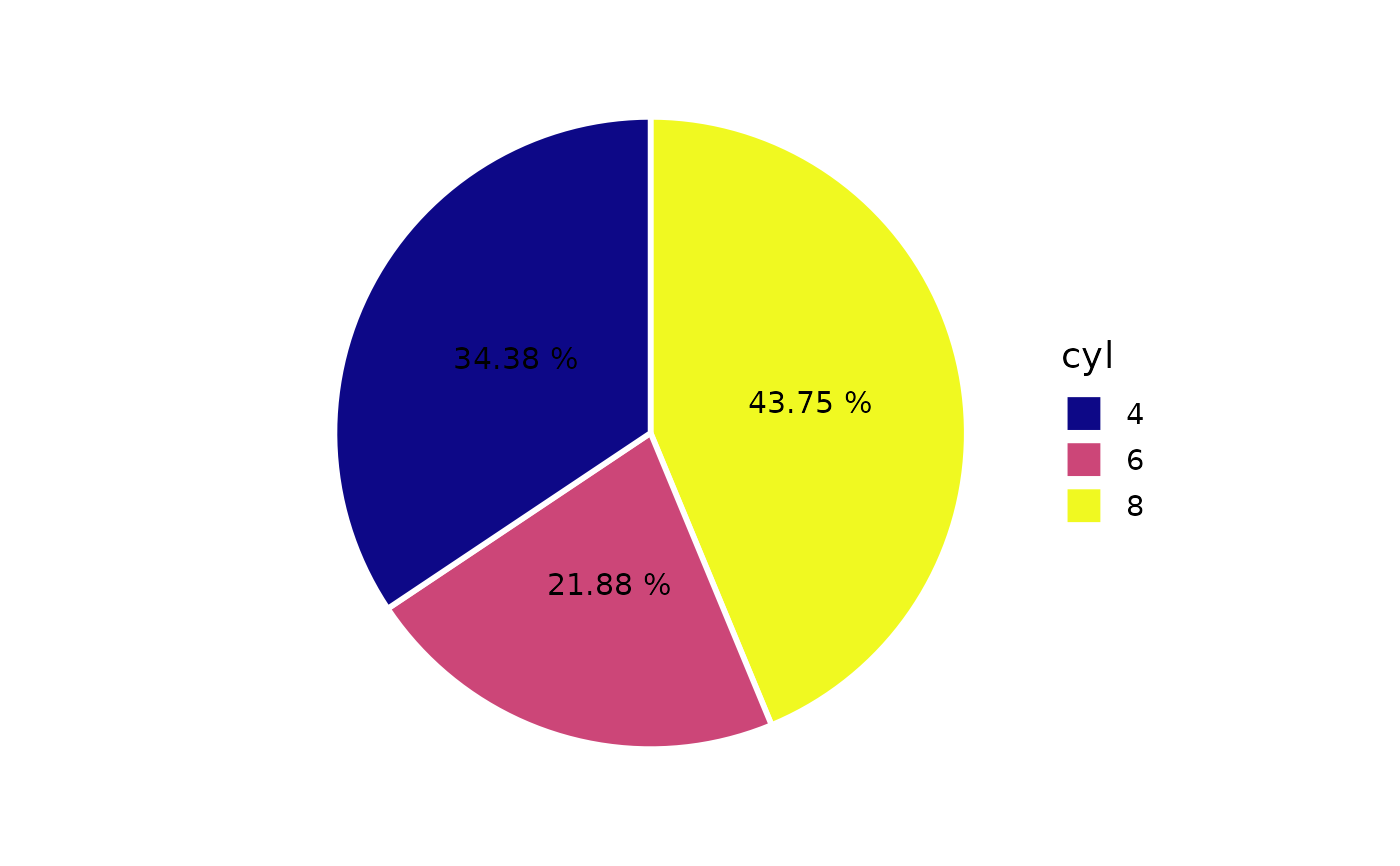
plot_pie(mtcars,
         fill_var = cyl,
         slice_text = "pct",
         slice_text_suffix = "%",
         colour = "white",
         round_n = 2)